A landing page is the essence of marketing campaigns for businesses. Further, optimizing the landing page works to refine and improve your website elements and eventually amplify conversion rates.
Optimizing a landing page establishes that your business is pacing in the right direction. Moreover, it ensures that your business might attain the highest possible conversion rate by using strategic optimization techniques.
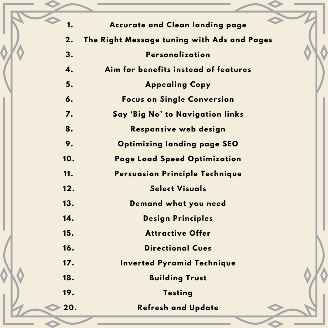
In this detailed guide, we have discussed 20 detailed landing page optimization tips that will boost the return of your ad spend (ROAS) to the next level. We will cover these 20 optimization tips:
- Accurate and Clean landing page
- The Right Message tuning with Ads and Pages
- Personalization
- Aim for benefits instead of features.
- Appealing Copy.
- Focus on Single Conversion.
- Say ‘Big No’ to Navigation links.
- Responsive web design.
- Optimizing landing page SEO.
- Page Load Speed Optimization.
- Persuasion Principle Technique.
- Select Visuals.
- Demand what you need.
- Design Principles.
- Attractive Offer.
- Directional Cues.
- Inverted Pyramid Technique.
- Building Trust.
- Testing.
- Refresh and Update
Let’s learn!
Top 20 Landing Page Optimization Tips
Following is the list of 20 landing page optimization tips. Let’s learn:
1. Accurate and Clean Landing Page
“First Impression is the Last Impression”
We have heard this quote often. Interestingly, it works for your landing page as well. And, the ingredients for creating the right impression that attracts customers include — captivating copy and perfect design.
Make sure to make your landing page ‘On-Point’ — in terms of design and copy. Moreover, it is quite obvious that you want to add extra information, but it might backfire.
Choosing and implementing the right design incorporated with an accurate copy would work wonders for your landing page. As a result, customers will learn about your services and offers in an instant.
In addition, try to use easy language in your copy and also add the right color combination for design. Also, you need to keep a limited amount of words for your copy instead of cluttering it with long forms. Otherwise, the bouncing rate would significantly increase and you will end up losing customers.
Both these factors are highly crucial when it comes to the landing pages for your professional service. Therefore, you need to strategically optimize your landing page.
2. The Right Message Integrated with Ads and Pages
“Make the First Chance Count”
When customers tap on your ads and are directed to your post-click landing pages, then that’s it. Simply put, you will get that one chance to compel customers to stay and explore. Or else they will leave with a negative impression about your landing page.
So, the question arises how will you make them stay? Well, we need to understand the psychology of customers before diving into the next level. Generally, customers look for a few things on any landing page. It includes:
- Logo at the top of the page.
- An amalgamation of colors used in brand design that matches with ads.
- The compelling headline and effective copy.
- Similar media aspect, which appeared in the advertisement.
- Conveying message in customer’s language
The main focus of landing pages should be convincing customers that the page is worth their time and effort. Further, you have to earn their trust by providing the exact same service or thing that they are looking for.
However, if customers find any bait, then they will automatically switch to other pages. And, you will lose your customers. To avoid this situation, make sure that your message equates with your post-click landing page and advertisement.
In addition, focus on balancing colors, copy, and branding that would attract customers to click on ads leading it to conversion on your page.
3. Personalization
It is important to personalize messages to achieve the relevance that further drives high return of your ad spend (ROAS).
Furthermore, personalized advertisements and pages will lead to offering relevant content. It helps to form a meaningful narrative that conveys the right message to customers. Nevertheless, you need to have strong research and understanding of your target audience. As a result, it will form a strong foundation to personalize and scale your messages.
Moreover, you will find certain conversion rate optimization tools that will guide you with trust and relevance. However, they may not be effective when it comes to offering in-depth understanding. And, it will also not guarantee conversion and persuading your audience.
4. Aim for Benefits instead of features
“XYZ cream product offers SPF-50 ”
or
“XYZ cream product offers SPF-50 that protects your skin from UBA/UVA rays.”
Which statement attracts your most?
Of course, the second one! Isn't it?
This example portrays that customers incline more towards benefits than features. They care about those features that work for them.
Further, let’s break down the above statement. The first statement shows the features of SPF-50 included in the cream. However, in the second statement, you will find how exactly SPF-50 benefits you.
So, make sure to focus on persuading customers regarding benefits, which they will obtain from features. Eventually, let the audience explore and learn how those products can improve their lives. And, it further would automatically help in conversion.
5. Appealing Copy
When the audience visits your landing page, it is crucial to compel them to stay and invest. But, how can you effectively do that?
There are certain aspects when it comes to landing pages and attracts customers. And, one of those aspects includes ad copy. Most of the time, the audience doesn’t go for old notions of ‘sign ups’ and ‘Register.’ Therefore, advertisers work harder towards transparency, genuineness, and creativity to curate fascinating ad copy.
Understand this, customers don’t require marketing copy as it is wearisome, sales-focussed, and centered. In addition, customers are also not interested in learning about products or services. However, it is important to read marketing copy to know how that specific product can improve your life.
But, if the audience is not reading your content, then how will you sell it? Therefore, you need to aim at creating a compelling copy that attracts your audience. Few components of compelling copy include:
- Make sure to write a conversational copy. It helps to grasp the audience’s attention and convey the narrative.
- Try to use short lines in your copy. If you go beyond four lines then your readers will lose track.
- Skimming is the best concept to use in copy. Including different sections of copy with — headers and subheaders will hold the audience’s interest.
- Make use of bullet points that will easily convey the message along with the benefits.
- Implement personalization in your copy. It will make your content interesting and add value to it. Avoid using generic copy and personalize copy on each post-click landing page.
- Promise to deliver positive results when you highlight the advantages of owning your products. It boosts trust and enthusiasm in customers.
6. Focus on Single-Conversion
In case you share the spotlight of a particular product or offer, then customers will end up being disappointed. Therefore, you need to generate a post-click landing page that aims at a single-conversion goal. It will provide the audience exactly what they are looking for.
The majority of advertisers assume that including certain offers on their landing page will attract more audiences. Instead, this method ends up as a flop. As a result, it simultaneously decreases the conversion rate.
Furthermore, you need to research and analyze your target audience and work on copy accordingly. Because cluttering multiple contents for various audiences will lower the chances to target the potential audience. Therefore, make sure to include a specific copy of the product or service that showcases benefits, overcome obstacles, and persuade the target audience.
7. Say ‘Big No’ to Navigation links
When potential prospects visit your post-click landing page, then numerous distractions could steal their attention. It includes incoming emails, open tabs, push notifications, and much more. And, obviously, you cannot afford to lose them over those distractions.
Therefore, you need to remove all navigation links from your page. Make sure to remove navigation links (in the header), in-content links, and sitelinks (in the footer). These factors only divert your customer’s attention to some other route from your landing page.
Ultimately, this optimization tip is quite crucial to implement when it comes to landing pages.
8. Responsive Web Design
Responsive web design is crucial in today's digital landscape, especially considering the widespread preference for mobile phones over laptops for surfing. Moreover, there include certain methods to access pages through mobile phones as well.
Nevertheless, the audience demands readable content along with certain other aspects. Make sure to provide clear and high-quality images, the right font and size of the copy, buttons placed in the right place where the audience can easily access them with a finger pad. All these factors highly matter for a well-designed mobile web responsive post-click landing page.
9. Optimizing Landing Page SEO
Creating a landing page is one part and optimizing is another. Both these elements play an important role in landing page dimensions.
No matter if you create the best landing page, however, it won’t be enough. Consequently, you also need to make sure that your audience finds you. To fulfill that you need to work on the landing page— SEO(Search Engine Optimization). Follow the below-mentioned techniques:
The primary step is to add keywords to the page title. Further, make sure to include keywords in the URL of your landing page. Moreover, your landing page should have a title, which needs to be used while creating a landing page on your website.
Secondly, make use of keyword phrases and keywords in your text. It provides clear to search engines what exactly your page is about. Imagine speaking to search engines in a similar manner as you speak to customers about your products and services.
Thirdly, make use of meta tags in titles, keywords, and descriptions. Further, don’t forget to add Alt tags when it comes to image descriptions. Eventually, meta tags are read by Google when it comes to ranking your website.
Lastly, include social share tabs. Moreover, you need to place share buttons on the landing page where customers can easily find them. It further helps when it comes to ranking your website on search engines such as Google.
10. Page Load Speed Optimization
The conversion rate depends on certain elements— including page load speed. Nothing can beat a faster-loading website. In case, your website loading speed is low, your customers will route to another website. And, you will end up losing customers.
Improving page load speed will help to boost landing pages and determine your business’s success. You can implement these effective ways to landing pages. It includes:
- Avoid adding images with big file sizes.
- Generating landing pages with AMP.
- Removing irrelevant JavaScript.
Furthermore, AMP stands for Accelerated Mobile Pages, which is a framework for creating pages using a lighter version of regular HTML. Though it used to be fairly limited in terms of what producers could create. Furthermore, AMP now allows you to publish interactive landing pages, progressive web apps, and even full websites.
11. Persuasion Principle Technique
You surely might have heard of the persuasion principle by Robert Cialdini. And, it definitely works.
Interestingly, Cialdini spent years observing practitioners in some of the most persuasive industries. And, he further developed six principles. Moreover, anyone can apply these six principles to persuade consumers to take advantage of an offer:
Here is the list of six principle elements that you should implement on your landing page:
12. Select Visuals
It's never easy to choose aesthetics for post-click landing pages, but it's critical. The difference between a conversion and a bounce can be determined by the right visual.
First and foremost, experimenting with various sorts is always a smart idea. However, some pictures are better suited to communicating various ideas than others:
- Infographics are excellent for presenting data in a visual style that can be compared and contrasted.
- Hero shots show how a product can improve a visitor's life in just a few seconds.
- Introductory films are ideal for firms that rely on a specific person's reputation (personal brands).
- Explainer videos are especially useful for explaining new or complex services.
- While breaking up the words, icons might assist visitors to understand a topic.
- Product shots can illustrate a product from all angles or demonstrate how it operates.
- Video testimonials give your offer more credibility.
- While breaking up the words, icons might assist and direct visitors to comprehend a topic.
Each of these images has its own merits, but there's no rule that says you can't use more than one. However, there is one cardinal rule concerning images that you must always obey.
13. Demand what you need
Forms necessitate a careful exercise of balancing. Moreover, too many fields will turn off visitors, but too few will result in a large number of unqualified leads who are unlikely to become customers.
Furthermore, marketing and sales must work together to identify marketing qualified leads and sales qualified leads for the best form size. In addition, you can ask for these facts via lead capture landing pages throughout the funnel. Nonetheless, if you know the exact information you need to acquire to anticipate whether visitors will become customers.
There should be no optional fields on these pages' forms. If something is optional, it isn't required. Furthermore, each field you add reduces the likelihood that someone will complete it entirely. So, on your lead capture pages, do your best to figure out what you need to know and just ask for that.
14. Design Principles
Implementing spectacular designs to a landing page works effectively to attract customers. Moreover, it also supports the audience to become long-term customers and eventually leads to a rising conversion rate.
Suppose that each segment is well-designed, the text is represented in skimmable bars, and the page is clutter-free. It will guide customers in an organized manner. Moreover, it simply means that the best way to present a landing page should be in sequence and directional. Then, the concept of visual hierarchy swoops in.
Follow this below-mentioned table that will make your work easier:
15. Attractive Offer
B2C customers are inundated with coupon codes, while B2B customers are inundated with tip sheets. You're capable of more.
However, this doesn’t mean that coupons and tip sheets aren't useful. But, the reason is that they’re difficult to sell due to certain reasons.
Therefore, make sure to research and inquire about all the resources under whose name you will provide coupons. Then, you need to further target advertisements that work better than tip sheets and coupons. And, ultimately it will make customers attracted to your products and will lead to significant inc
16. Directional Cues
In an ideal world, visitors would land on your page and behave as you want them to be. Obviously, they'd glance at your title, graphics, and body copy before making the final decision of investing in your business, However, it doesn’t work exactly when it comes to the real world.
Frequently, visitors miss important details that could help them assess whether or not an offer is worth claiming. Moreover, missing these elements such as design flaws, distractions, and much more— conveys that the audience missed an important part. Therefore, to combat that situation, you need directional cues.
These cues remove any doubt from the design process. Moreover, there's always a potential that your visitors will miss anything. It doesn’t matter how carefully you layout a page. But that chance is significantly lower when you have a conspicuous arrow pointing to your Call-to-Action (CTA) button.
Ultimately, you need to implement direction cues from model gaze to pointing arrows to guide customers.
17. Inverted Pyramid Technique
This technique is not only limited to landing pages, but also to entire web content. Furthermore, customers generally don't have much time to invest and read into every single content.
Therefore, marketers have to use this strategy to make sure their customers are glued to provided content and understand what your business has to offer. So, the content provided by the use of the inverted pyramid technique results is informative, relevant, and easy to skim.
Interestingly, the inverted pyramid technique has been followed for years in the journalism field. And, it further got transferred to other areas as well such as content writing, landing page copy, and more.
18. Building Trust
Gaining the trust of your customers is the most crucial aspect of any business. It helps to retain the audience's confidence and long-term loyalty towards your product or services.
Following is the table of certain pointers that will support your business to gain the trust of your customers. It includes:
19. Testing
A/B testing is one of certain approaches that analyzes and tests, which further determines conversion rates. Moreover, certain companies use A/B testing to select the ideal element that works for their landing page. However, businesses should consider multivariate testing that will help them to discover the optimal version that could be beneficial for landing pages.
In addition, make sure to often do testing and follow a certain set of rules and tools to choose the right performing version. Also, make sure to always start testing with your data and instantly implement the required modifications.
20. Refresh and Update
Not every time your audience will convert into customers by signing up or downloading or purchasing products or services. It generally is a time-consuming process. Moreover, to witness positive results, you have to retarget numerous times.
Note that customers often get bored and disappointed looking at the same landing page. Therefore, to tackle this situation you need to refresh and update your landing page to avoid campaign fatigue. You can do it by updating creative headlines, adding unique and high-quality images, generating new ad copy, and much more. Also, you need to keep an eye on and analyze ROAS often to keep it balanced.
How Deskera Can Help You?
Deskera is one of those unique software that facilitates the designing and management of landing pages through your CRM software. For this, Deskera CRM+ is what you are looking for.
Deskera CRM+ is a software that has a special section dedicated to landing pages. This section is designed such that it will help you throughout the process of designing, launching, tracking and optimizing your landing pages.
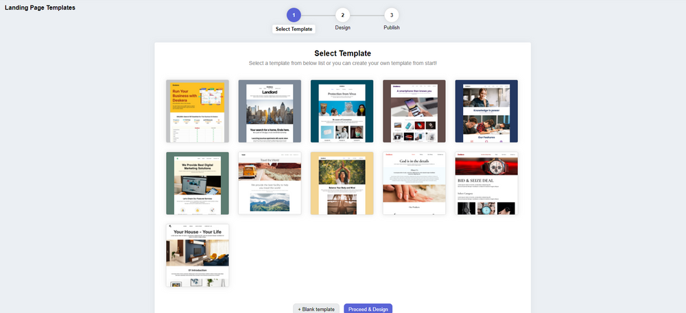
Deskera CRM+ comes with some pre-installed landing page templates that you can use or you can even choose to design your landing page from the start. Both of these options are supported in the Deskera CRM+’s landing page module. This will ensure that you can create beautiful and professional-looking landing pages that generate leads without the help of any designers or IT professionals.
With Deskera CRM, you can enhance your business productivity by facilitating the automation of your email marketing strategies. Deskera is based on a cloud system model that can help to fulfill all your business needs. Be it data integration, or real-time analytics, Deskera can help you in every aspect.
Deskera CRM is the best platform that can help you with contact and deal administration, sales pipeline management, email marketing campaigns, to name a few. Not only this, but you can also generate leads for your business by creating email campaigns and view performance with detailed analytics on open rates and click-through rates (CTR).
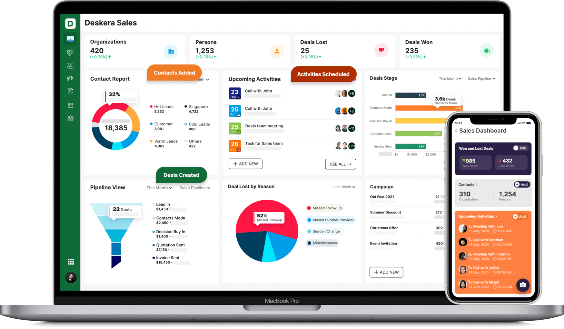
Deskera is a cloud-based technology that automates corporate processes and thus makes them easier to manage. It cuts down on administrative time while simultaneously enhancing productivity.
Deskera provides you with solutions such as Deskera CRM Plus that can help your business by providing you with landing page building templates for your business. Deskera CRM helps small businesses get more from each landing page you create. It lets you build and optimize landing pages that prompt you to improve conversions for your business and increase your sales and revenue. You can create good lead magnets to generate better responsive landing pages.
Deskera CRM Plus provides you with the tools and template to build customized landing pages as per your business. It provides you the option to modify images, text, customer sign up form, embed custom html and let's you monitor your website visitors behaviour. Using the website and landing page analytics, you can understand your customer's psychologyand improve your sales.
Having a focused sign-up landing page, your business will be able to increase it's customer database and will help you retarget your existing customers and also manage customer deals and sales funnel better. Managing your customers using a good CRM system, will save your business lot of time and money in the long run.
So, don’t wait anymore, get going with Deskera and ensure the success of your business!
Key Takeaways
Finally, you made it to the end section of this encyclopedic guide. Let’s cover important optimization tips that we have learned so far. It includes:
- Make your landing page ‘On-Point’ — in terms of design and copy.
- Your message equates with your post-click landing page and advertisement.
- Make sure to focus on persuading customers regarding benefits, which they will obtain from features.
- You need to generate a post-click landing page that aims at a single-conversion goal.
- Remove all navigation links from your page.
- Provide clear and high-quality images, the right font and size of the copy, buttons placed in the right place.
- The conversion rate depends on certain elements— including page load speed.
- Implementing spectacular designs to a landing page works effectively to attract customers.
- Often do testing and follow a certain set of rules and tools to choose the right performing version.
- Refresh and update your landing page to avoid campaign fatigue
Related Links


