If you are a marketer who has been striving to make significant conversions but hasn’t been successful, this article could lend you tips on how to spot and avoid the common landing page mistakes. Although a digital marketing journey comprises a lot of trials, errors, experimenting, wouldn’t it be great if we learned about the common errors we have been making all this while?
This article talks about the 10 Landing Page Mistakes to Avoid along with the ways to fix them.

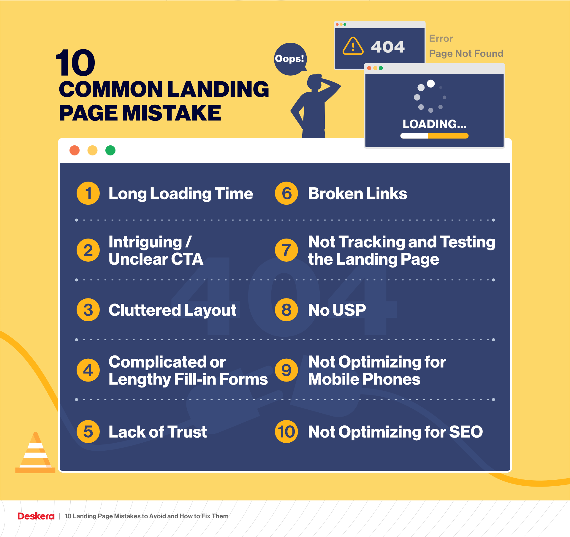
10 Common Landing Page Mistakes to Avoid
You have a great landing page that has generated a sizeable number of leads. But there is something that bothers you: Negligible conversions. As your conversion has dropped, so has your ROI. The only thing that has increased is the bounce rate.
So, how do you deal with this? Are you making some of the common and biggest mistakes in your digital marketing voyage?
Let’s take a tour of the 10 biggest landing page mistakes digital marketers make, along with the fixing techniques.

Long Loading Times
A slow-loading page is rightfully the topper of the list. It leads to annoyance and frustration, but it also gives away an awful impression of the brand. According to surveys, marketers tend to lose approximately 50% of their visitors owing to this reason. On average, a first-time visitor may only give the page 3 seconds to load, after which he may snap away.
Apart from making you struggle with your customers, a slow-loading page is to blame for your lowered or negative ranking on Google. This makes matters worse, as a low Google ranking will take you farther away from the prospects; as it will be difficult for them to find and land on your page.
This is also called slow page response, which is responsible for an elevated number of page abandonment.
How to Fix Long Loading or Slow Loading Page
How to Fix Long Loading or Slow Loading Page
When trying to fix this issue, you could look for the potential problems and factors that give rise to it, such as:
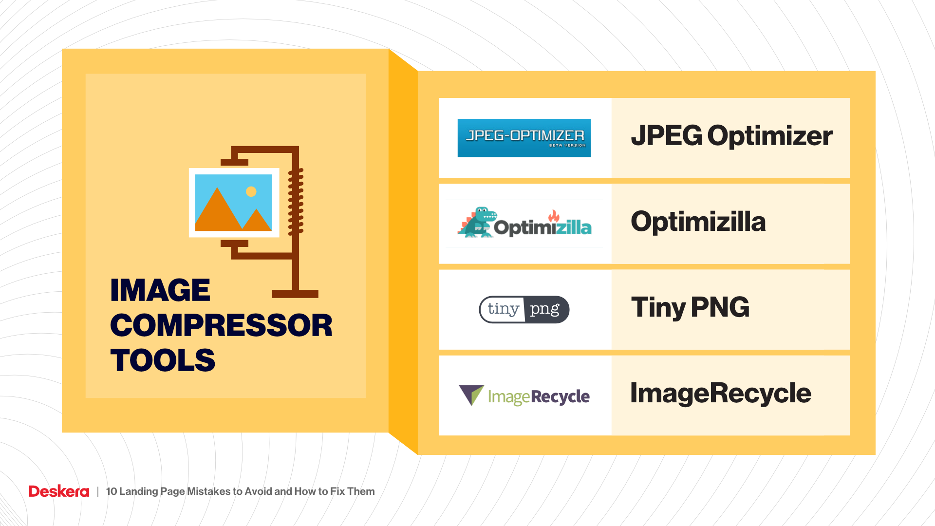
Images: Check for the optimum size. If your images are too large or too small, fix them. Upscale images, resize them or look for compression as an alternative. Images that fit well on the layout of your landing page can be advantageous in more ways than one.
Images with high resolution can look impressive, but if they slow down your landing page’s loading, optimizing them would be a wise decision to make.

Large Media Files: These are other sets of culprits that result in sluggish loading. If you have incorporated audio and video files on your landing pages, these could largely hamper the user experience especially on mobile devices. You can fix this issue by correcting their formats before uploading. Also, optimize the page based on the device the user would be using.
In simple words, you could upload multiple versions on the cloud and deploy the one appropriate for the device used.
Intriguing or Unclear Call-to-Action
A visitor has landed on your page and is probably convinced with your offers and products. However, he is unable to find the next step in the course. Reason: Unclear CTA.
Your CTAs should be clear and very visible to the visitor. He is looking to be guided into taking the next step now, and if he cannot, you shall lose this customer.
Here is a set of issues you could fix with regard to this:
- Too many CTAs
- Unclear Font
- Merging color of CTA with the background color of the landing page
- Complicated Text
Unclear CTAs are just one of the problems with this. There are landing pages where the marketer has introduced too many CTAs. Having more than one clear CTA will only confuse the user and will ultimately lead him to leave your page.
Cluttered Layout
Too much text, too many images, lots of boxes, a scattered layout is not what you want your page to look like. No wonder, a visitor lands, and leaves just as quickly.
When the visitor is on your page, you don’t want them to feel lost in the ocean of information that your landing page showcases. It has a poor visual appeal and gives enough reasons for the user to drift away.
Complicated or Lengthy Fill-in Forms
No user wants to be bombarded with forms that need them to fill in a lot of details. Asking them about Name, E-mail, Phone number, Address, Job Status, Company Name, Comments, and other information may be too much to handle for a new visitor.
Lack of Trust (No Social Proof)
This pertains to various aspects and elements that are a part of your landing page. Outdated image formats, or unclear images, too flashy visuals, uneven layout, old-fashioned color schemes, musty feel all contribute to the larger problem: Lack of Trust.
When a visitor is on your landing page for the first time, they are unfamiliar with you or your business. However, they came looking for solutions or some products they anticipated on your page. Imagine them encountering the mentioned scenario of uneven format on the landing page; they are not going to find it trustworthy and may move on for a better offer.
Broken Links
This is possibly the most lethal weapon that kills conversions. Your visitor is ecstatic to land on your page only to find that the link is broken. The back button is the only option they are left with, and you lost a potential customer there.
Chances are they may never turn up again as they had had a bad experience. They are probably going to remember that, even the next time they come across your page.
Not Tracking and Testing the Landing Page
Analytics and statistics are an integral part of your marketing campaign. Monitoring these analytics lets you know how your page is fairing in terms of rankings. Failing to track these is a landing page mistake that could prove fatal in the long run.
Tracking gives you an insight into the areas that need your attention as well as the ones that are doing well. Similarly, testing your landing page enables you to know if the page runs fine and appears the way it ought to.
No USP
Your USP lets your prospect know that they shall be receiving something unique that the other sellers or vendors may not offer. Your USP could help them take the final call and eventually, enhance your sales to a great extent.
When there is so much riding on the USP, overlooking this major aspect would be detrimental to the marketing campaign. You know you have something amazing and lucrative to offer, then why not highlight it on your landing page. Not doing so, is a potential landing page mistake.
Not Optimizing for Mobile Phones
With the recent data suggesting that a majority of people turn to the internet through their mobile devices, it becomes imperative to make your landing page optimized for mobile phones. If you haven’t optimized then it’s a landing page mistake that hampers the user experience; ultimately leading you to lose customers.
Not Optimizing for SEO
Optimizing the page for SEO simply means writing the content on the landing page to optimize it for the search engines. A good-looking page that has great images, visuals but lacks the right content may not click with the search engines. This will limit the visibility of your page and consequently, hampering your business.
How Can Deskera Assist You With Your Landing Pages?
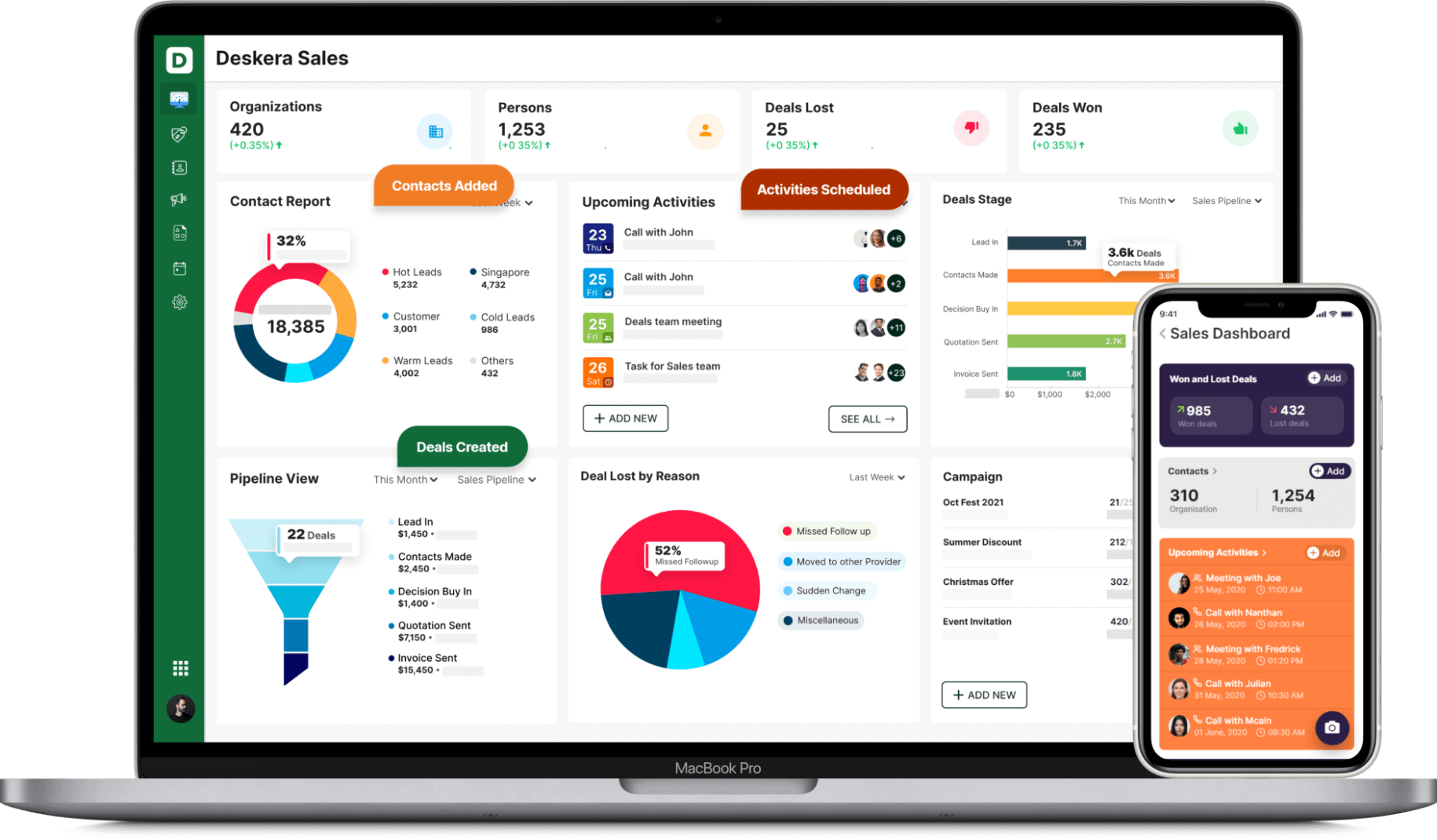
Deskera CRM+ is a software that has a special section dedicated to landing pages. This section is designed such that it will help you throughout the process of designing, launching, tracking and optimizing your landing pages.
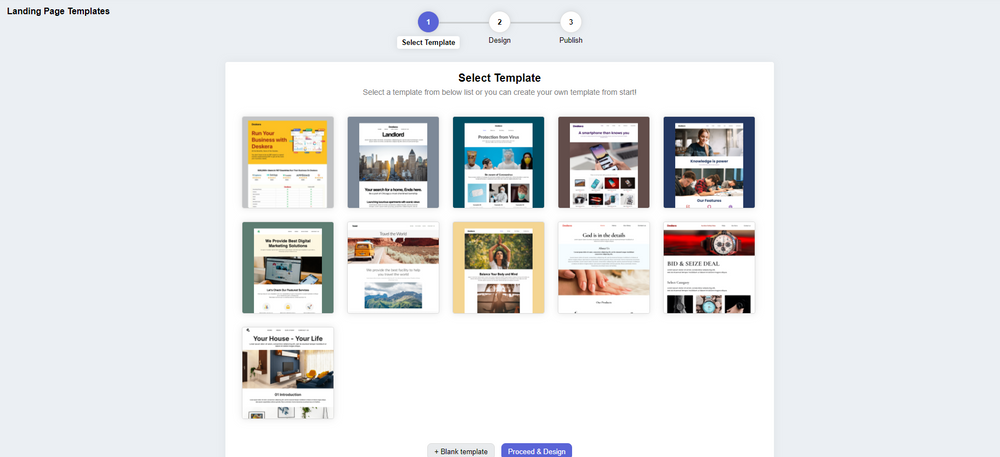
Deskera CRM+ comes with some pre-installed landing page templates that you can use or you can even choose to design your landing page from the start. Both of these options are supported in the Deskera CRM+’s landing page module. This will ensure that you can create beautiful and professional-looking landing pages that generate leads without the help of any designers or IT professionals.

With Deskera CRM, you can enhance your business productivity by facilitating the automation of your email marketing strategies.
It is the best platform that can help you with contact and deal administration, sales pipeline management, email marketing campaigns, to name a few. Not only this, but you can also generate leads for your business by creating email campaigns and view performance with detailed analytics on open rates and click-through rates (CTR).

Deskera CRM helps small businesses get more from each landing page you create. It lets you build and optimize landing pages that prompt you to improve conversions for your business and increase your sales and revenue. You can create good lead magnets to generate better responsive landing pages.
Deskera CRM+ provides you with the tools and template to build customized landing pages as per your business. It provides you the option to modify images, text, customer sign up form, embed custom html and let's you monitor your website visitors behaviour.
Having a focused sign-up landing page, your business will be able to increase it's customer database and will help you retarget your existing customers and also manage customer deals and sales funnel better. Managing your customers using a good CRM system, will save your business lot of time and money in the long run.
So, don’t wait anymore, get going with Deskera and ensure the success of your business!
Key Takeaways
It’s wrap time and we hope to have presented the information comprehensively, to assist you in warding off all the landing page mistakes. Let’s recap the important points in this final section:
- A slow-loading page is one of the top problems that hinder conversion. Large image and video files could be resized to tackle the mistake.
- Unclear CTAs could be fixed with some quick experimentation that ensures that the visitor is correctly guided toward the next step.
- A cluttered layout can be fixed with a keen eye for laying the fields in an appropriate order on your page. Clear visuals and lesser text can remove cluttering.
- Avoid including lengthy and complicated forms on the landing page
- Integrate social proof and testimonials from previous customers to ensure the new visitors of your credibility. This helps the new customers trust you.
- Fix broken links, if any, on your page with the help of tools.
- Keep a track of the analytics of your page and test your page for its performance.
- Highlight your USP well on the page to introduce your new prospects to your world of offers and services.
- Pay attention to the optimization of your page for mobile devices.
- Optimize your page for SEO content to attain better rankings on search engines
Related Links


