Let’s face it. People who visit your page for the first time don’t know anything about you. Do you know how much time does it take to attract the attention of a visitor?
8 seconds it is!
To turn your visitors into leads in such a short span of time, the landing page should be intriguing! While there is no exact formula for creating the perfect landing page, there are some best practices that you can follow to enhance your conversion rate.
Whether you are creating the landing page for the first time or have already done it multiple times, this article can be quite useful for you. There's plenty of knowledge to absorb in this article if you want to get your hands on the best user experience, and conversion rates.
What is a Landing Page?
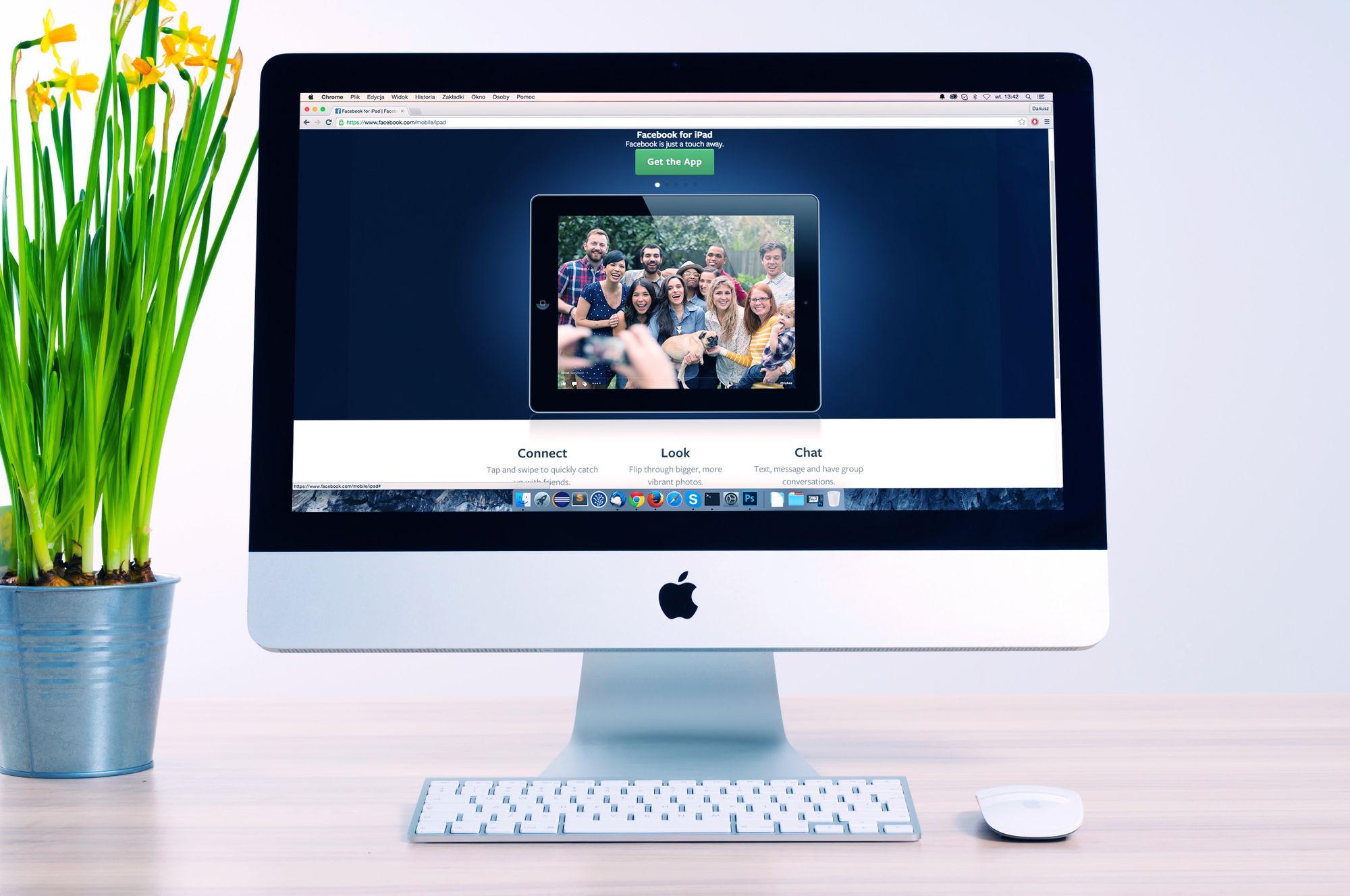
A landing page is a page where a visitor arrives, after clicking on the ad or an email. It is specifically created for marketing and advertising campaigns.
Unlike home pages, landing pages are designed specifically for a single goal or purpose, known as a call-to-action. That is why they act as the best option for increasing the conversion rates and lowering your cost of acquiring a lead or a sale.
How do Landing Pages Work?
- A person clicks on the ad and arrives at a landing page.
- A landing page has a form.
- The person fills that form, which converts him/her into a lead.
- The information gained from the form gets stored in your leads’ database.
- You reach out to the lead based on the information you gained.
A visitor will fill out the form on the landing page because he will believe that the content, he is accessing will be valuable to him. On the other hand, a marketer will happily provide the content to the site visitor in order to use the valuable information the visitor provided on the form for future marketing efforts.
What Do You Need to Know Before Creating a Landing Page?
Before you think of creating a landing page, you need to do background research needed to put it together effectively.
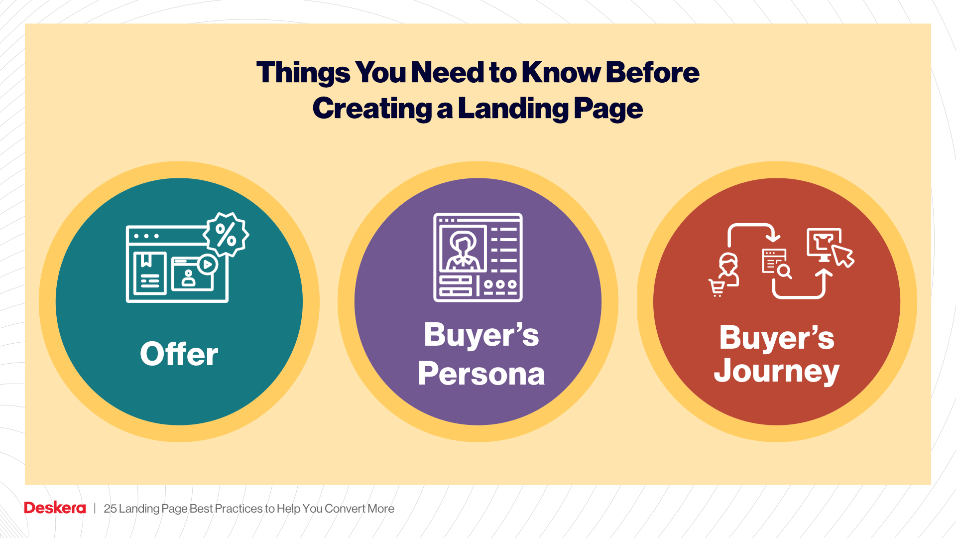
Let’s take a look at some of the things you need to know before creating a landing page:
The Offer
When you provide value to the website visitors besides the products or services you are selling, it refers to an offer. Be it a free e-book, webinar, comparison guide, or anything that is informative about your business, it should comply with your buyer’s persona and buyer’s journey.
The Buyer Persona
A buyer persona is nothing but a detailed description of your ideal customer. It is based on market research and current customer data. It can give you a clear insight into your customers’ behavior and how they think. This can be quite beneficial for you in developing the most valuable content for your target audience.
Instead of targeting multiple personas, make sure you target one persona, because this way your efforts will be more focused, thus improving your odds of conversion.
The Buyer’s Journey
A potential buyer goes through a series of steps before making the final purchase, this is known as the buyer’s journey.
It can be broken into three different stages: the awareness stage, the consideration stage, and the decision stage. Different types of content are required for each stage of the journey to help people move from one stage to another. Let’s take a look:
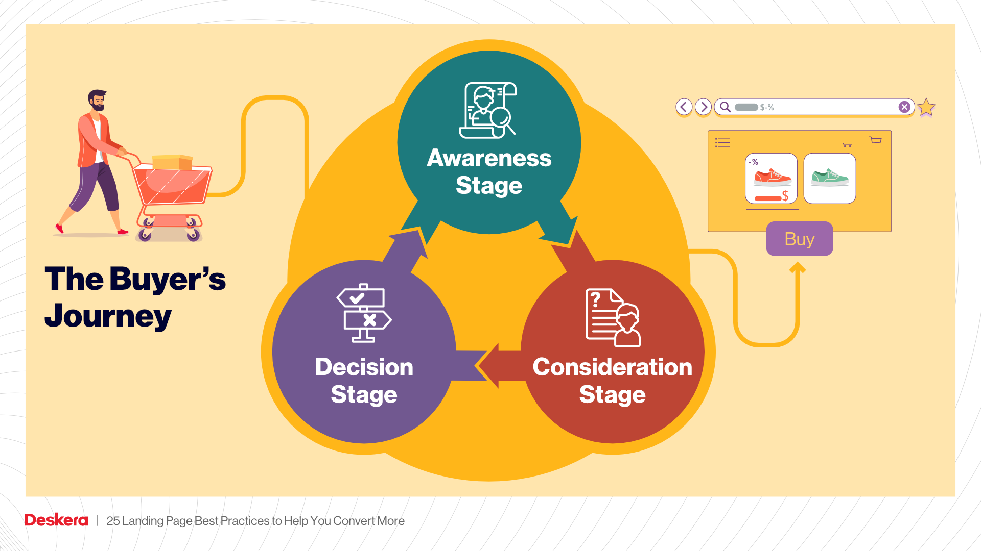
Awareness Stage: This is the first stage of the buyer’s journey in which the visitor tries to be aware of the problem he/she is facing. This awareness can be caused on its own or with the help of content that informs him/her of the problem. During this stage, a person does a lot of research to understand his problem or define what is causing it. Pieces of content to create and target people in this stage include e-books, white papers, and guides.
Consideration Stage: In the consideration stage, a potential customer clearly defines his problem, and now he is looking for ways to solve it. Types of content you should create for people in this stage of the Buyer’s Journey include comparison white papers, webinars, and videos.
Decision Stage: In this stage of the funnel, the visitor knows the solution. At this point, he is conducting various vendor comparisons. He is trying to narrow down the list of vendors to select a few before making his final choice. Case studies, demos, and product information at this stage can be quite beneficial in making the right decision.
What are the Landing Page Practices to Boost the Conversion Rate?
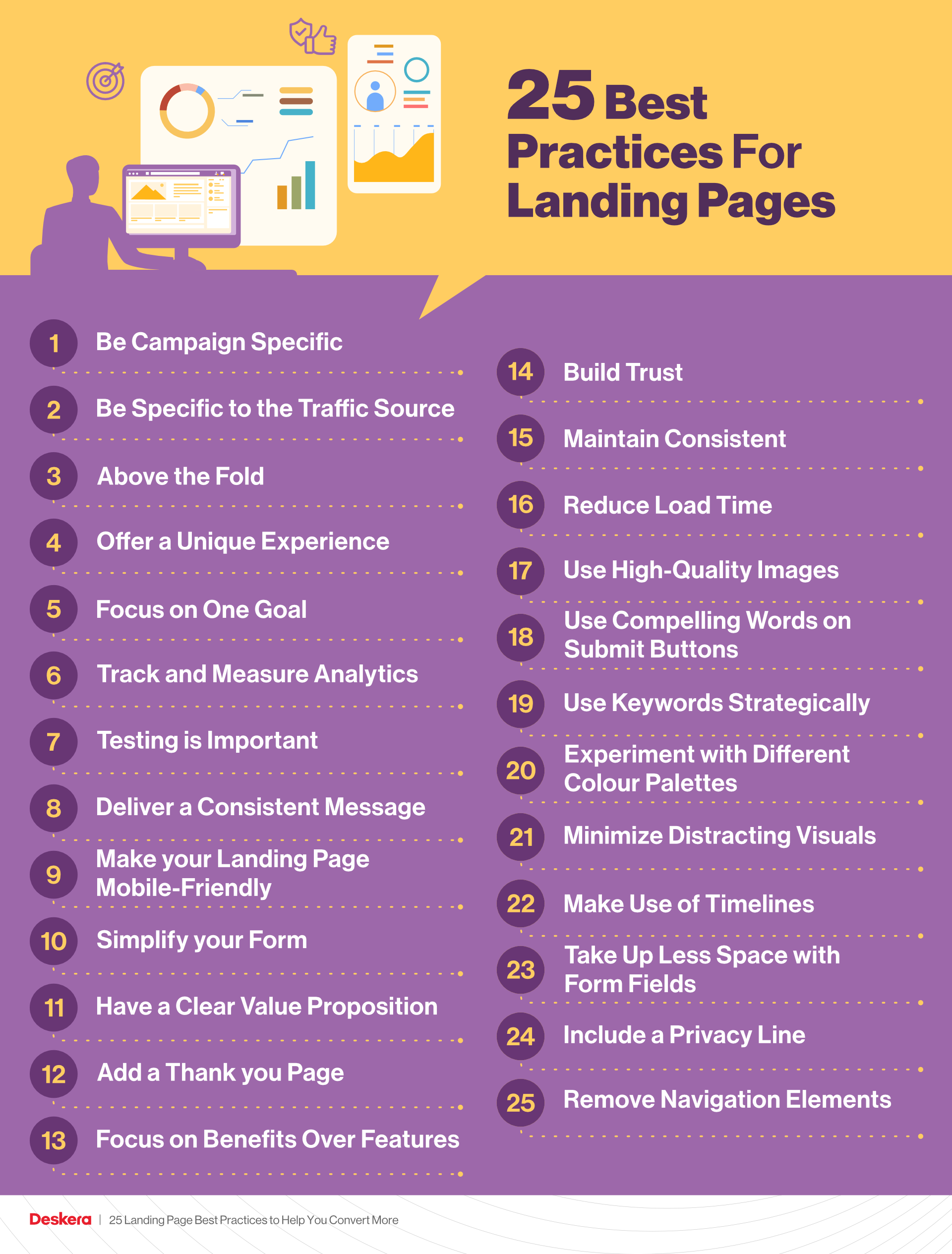
Let’s take a look at the best practices that you can follow to improve the conversion rate:
#1 Be Campaign Specific
An ideal landing page should be targeted, specific, and contextually relevant. The conversion rate will be higher when the landing page will be more engaging and specific to the campaign you are targeting.
#2 Be Specific to the Traffic Source
Focus on creating a customized visitor experience based on where they come from. For example, if you are focusing on directing traffic from a guest post on another site, the landing page should address the readers of that particular site.
#3 Above the Fold
This refers to the screen which is visible in the upper half of a web page. It is visible without scrolling down the page. It should be as engaging and impressive as possible in order to grab the attention of the visitors. This can be done by enhancing the headlines, and body with relevant keywords.
#4 Offer a Unique Experience
Innovative design, high-quality images, videos, and creative CTAs should be incorporated into your landing page to make it more intriguing for the visitors. This will encourage them to fulfill the target, that is filling the form on the page. The more unique the experience, the more chances of user engagement, hence conversion.
#5 Focus on One Goal
Your landing page should focus on one goal and strategy rather than engaging in multiple actions. Everything on the page should be aligned with that particular goal. For example, if your aim is to convert the visitors into newsletter subscribers and also to sell the product, then the chances of fulfilling these targets will be quite low. However, if you focus on only one target, then the chances of achieving it will be higher.
#6 Track and Measure Analytics
It is quite important to use real-time analytics on your landing page to get an insight into the amount of traffic, bounce rate, geolocation, and conversion rates. This will help you to identify the pitfalls and make the adjustments accordingly.
#7 Testing is Important
A/B testing is crucial if you want to improve the conversion rates. This will help you gather information about what your target audience finds interesting. Once you understand the split tests, you can easily know whether your website needs to be redesigned or rebranding.
#8 Deliver a Consistent Message
Make sure your landing page provides a consistent message before the visitors landed on it and after their conversion.
Any kind of consistency can lead to a reduction in conversions. If you make any promise to the visitors, make sure you fulfill that.
#9 Make your Landing Page Mobile-Friendly
With the advancement in technology, the usage of mobile phones has increased dramatically. No one can imagine their lives without a mobile phone! That is why it is important to make your landing page mobile-friendly.
The interface should be intuitive and user-friendly to ease the conversion. Avoid adding any kind of unnecessary information or design that distracts the visitors.
#10 Simplify your Form
Long forms that require a lot of information can turn off the visitors, thereby hampering the conversion process. Instead, go for short forms with limited information so that the visitors can easily fill in the information without any hassles.
Try to include your form above the fold so that it can be easily visible to the visitors.
#11 Have a Clear Value Proposition
Your landing page should provide proper reasons as to why any visitor should buy from you instead of your competitor. Don’t forget to mention the points that set you apart from the rest. You can also tell your buyer what he would gain from your product or service!
#12 Add a Thank you Page
Create a dedicated thank you page to deliver on the value promised on the landing page. It is the best way to build trust with your customers.
#13 Focus on Benefits Over Features
Instead of showcasing the features of your product or service, you should focus on the benefits it will offer for the customers. Once the customers know the outcome of the features of your product, they will rely on your product or service.
#14 Build Trust
Earning the trust of the customers is essential especially if they are not aware of your brand. For this, you can include testimonials and reviews on your website. You can even list industry awards and affiliations, and certifications on your website. This acts as ‘social proof’ and will help to build trust among the customers.
#15 Maintain Consistent Branding
Consistency is the key if you want to make your landing page stand out from the crowd. The overall design and style should be constant so that a visitor who has already seen your brand should immediately recognize it when he/she arrives at the landing page.
A brand helps to maintain a connection with the audience. That is why it is important to keep consistent.
#16 Reduce Load Time
In the modern era, where everyone is in a hurry, people expect everything to happen quickly. This is the reason why it has become quite essential to reduce the load time of the landing page.
If the landing page will take ample time to load, then your prospect customer will not wait and move towards another option. Thus, in this highly competitive world, it is important to minimize the load time so that the customer doesn’t run away.
#17 Use High-Quality Images
Images play a major role in attracting the audience. Thus, it is imperative to use high-quality images on your landing page. If you add low-quality images, it will make it difficult to understand the purpose of the landing page. Also, the potential customer can move away from your landing page to some other option. So, try to use high-quality and compelling images on your landing page.
#18 Use Compelling Words on Submit Buttons
Try to use specific yet compelling words on submit buttons. For example, you can use ‘Get a free quote’ instead of using ‘click here’ or ‘submit’ button.
This way you’ll increase the chances of conversion.
#19 Use Keywords Strategically
While creating a landing page, you should have a clear idea of the phrases that people might use while searching for your product or service. These phrases are known as keywords. There are three types of keywords such as primary keyword, secondary keyword, and semantic keyword.
For example, Primary keyword-webinar landing page, secondary landing page-best landing page, responsive landing page, best webinar landing page, etc., semantic keywords-webinar registration, sign up for a webinar, etc.
While writing content for your landing page, you need to keep in mind that it should be easily readable by search engine bots. This way it will make it easier to know what your page is about so that it can be indexed easily.
Try to incorporate different types of keywords including primary, secondary, and semantic keywords in your content. Make sure you place the keywords strategically in the sub-headings and body and avoid keyword stuffing.
#20 Experiment with Different Colour Palettes
Colour can have a major impact on the visitors to your landing page. Different colours portray different stories. For example, if you have red colour, it will act as an indicator of power and vitality, this is the reason why it is used for various sports brands. Green symbolizes growth, health, and happiness, keeping it the best option for health and wellness brands.
Adding a colour scheme to your landing page will help you in connecting with your audience in a better way.
#21 Minimize Distracting Visuals
It’s tempting to fill your landing page with all the beautiful buttons and latest bells. But these fancy animations and flashing banners lead to distraction and lower the chances of conversion. Instead, all this can lead to confusion.
If you want to add any kind of effects on your landing page, make sure you include them near the call-to-action button. This will draw the attention of the customers and help to fulfill the target.
#22 Make Use of Timelines
Landing pages that are centered around a specific holiday, season, or event can be beneficial as they allow you to create timely and relevant campaigns. You can make use of these themes to evoke emotion and to better connect with your target audience.
#23 Take Up Less Space with Form Fields
Make sure you don’t leave a lot of space between the form fields. The main aim is to have fewer elements on the page. Try to include maximum elements in a smaller space.
You can try to include 2 elements per line to occupy less space. For example, instead of asking first/last name in two separate lines, you can ask this information in one field itself. Try to reduce the amount of space in two separate fields.
#24 Include a Privacy Line
Keeping a privacy line below the form is important. This will help you in the overall conversion. You can include lines such as ‘We respect your privacy’, ‘We do not provide information to the third parties’. This helps in enhancing the trust factor that further helps in converting visitors into leads.
#25 Remove Navigation Elements
What is the main difference between a normal website and a landing page? Well, it is the navigation. The landing page shouldn’t include the usual site navigation. Instead, you should include only clickable links as the call-to-action. This will improve the chances of conversion to a large extent.
How can Deskera Help You in Your Business?
Deskera works on a cloud-based model that helps in the automation of corporate processes, making them easier to manage. It helps in reducing the administrative time improving the productivity of your business.
With Deskera CRM Plus, you can get access to the landing page building templates for your business. It allows you to build and optimize landing pages that further help in conversions for your business and increases your ROI (return on investment).
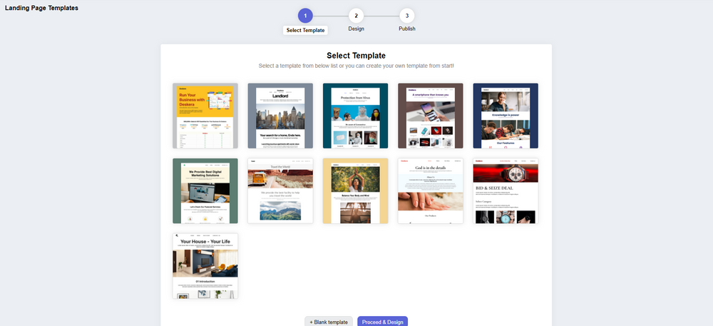
Deskera CRM Plus consists of the tools and templates to build customized landing pages tailored to the specific requirements of your business. It provides you the option to modify images, text, customer sign-up form, embed custom HTML, and allows you to monitor your website visitor’s behaviour. With the help of the website and landing page analytics, you can understand your customer's psychology and improve your sales.
When you use a focused sign-up landing page, your business will be able to increase its customer database. You will be able to retarget your existing customers and also manage customer deals and sales funnel in a better way. Using a good CRM system can help you in managing your customers, which will further save a lot of time and money in the long run.
With Deskera CRM, you can enhance your business productivity by facilitating the automation of your email marketing strategies. Deskera is based on a cloud system model that can help to fulfill all your business needs. Be it data integration, or real-time analytics, Deskera can help you in every aspect.
Deskera CRM is the best platform that can help you with contact and deal administration, sales pipeline management, email marketing campaigns, to name a few. Not only this, but you can also generate leads for your business by creating email campaigns and view performance with detailed analytics on open rates and click-through rates (CTR).
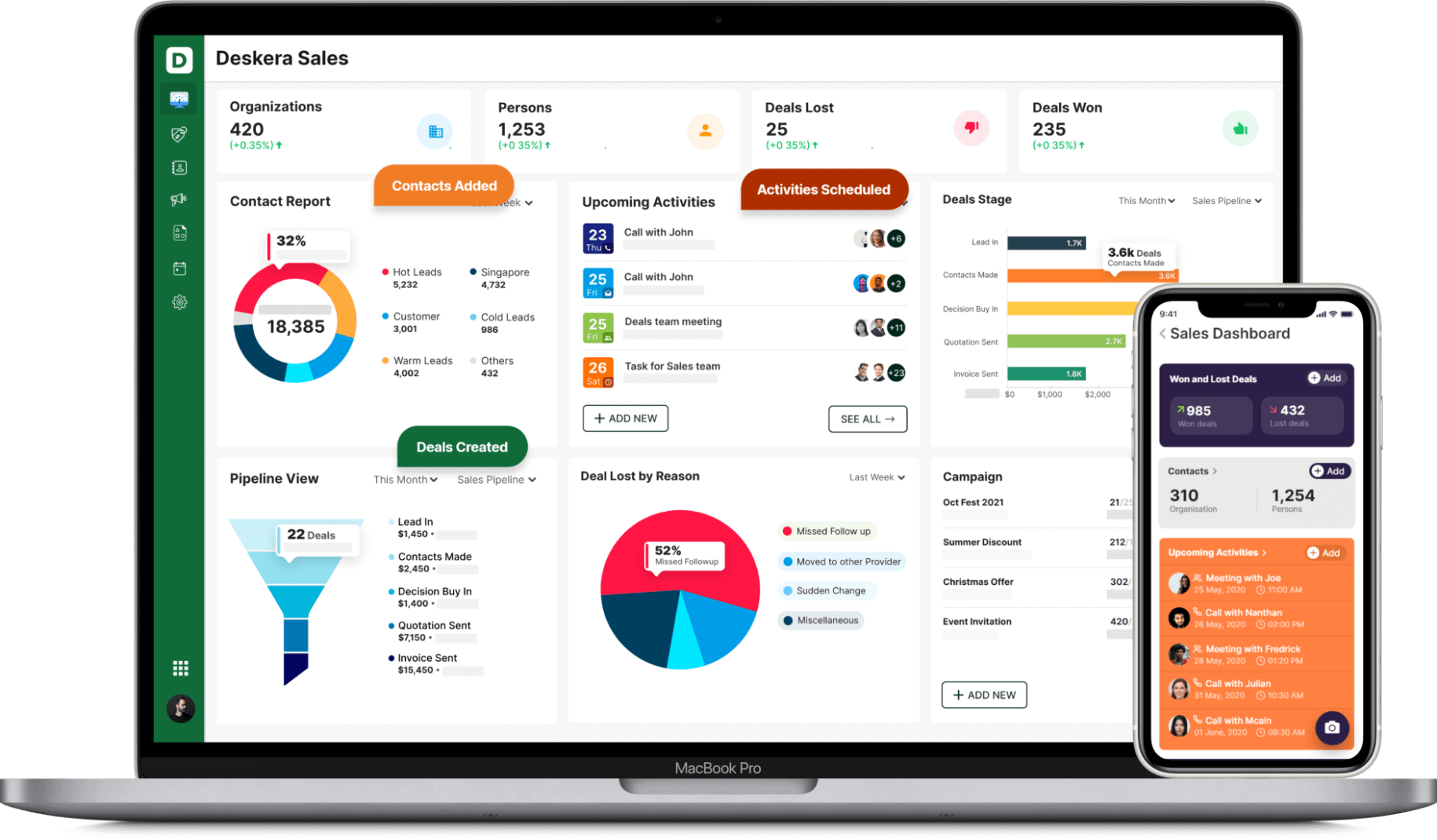
Deskera CRM helps small businesses get more from each landing page you create. It lets you build and optimize landing pages that prompt you to improve conversions for your business and increase your sales and revenue. You can create good lead magnets to generate better responsive landing pages.
Deskera CRM Plus provides you with the tools and template to build customized landing pages as per your business. It provides you the option to modify images, text, customer sign up form, embed custom html and let's you monitor your website visitors behaviour. Using the website and landing page analytics, you can understand your customer's psychology and improve your sales.
Having a focused sign-up landing page, your business will be able to increase it's customer database and will help you retarget your existing customers and also manage customer deals and sales funnel better. Managing your customers using a good CRM system, will save your business lot of time and money in the long run.
So, don’t wait anymore, get going with Deskera and ensure the success of your business!
Not only this, but Deskera’s All-in-One platform helps your business in various domains such as Invoicing, Accounting, Inventory, CRM, HR & Payroll, all under one roof. Deskera Books covers all the significant aspects of business such as billing, payments, warehouse management, Credit &Debit Notes, financial reports, an elaborate business dashboard apart from many other features.
With Deskera by your side, you can take your business to the next level.
Key Takeaways
- A landing page is a page where a visitor arrives, after clicking on the ad or an email.
- A landing page works in some specific ways that have been discussed in this article.
- You need to know a few things before creating a landing page.
- Various landing page practices can be followed in order to boost conversions. These practices have been discussed in this article.
- Deskera is the best platform that can help you in ensuring the success of your business
Related Links


