An event landing page is basically a kind of web-designed page to persuade audiences to register for a forthcoming event. Further, it is a sort of in-person event like virtual events, conferences, webinars, and online summits.
Creating an event landing page is quite easy, but you need to make sure all attendees become clear with all the details. Moreover, your event page should be attractive, have clear instructions, and be filled with creativity that influences visitors.
Generally, all kinds of events overlap with similar goals such as generating event awareness and make visitors sign up or buy tickets.

In this guide, we have covered elements of the event landing page. Also, we have researched and summarised the top 10 event landing pages examples.
Furthermore, these examples will inspire you for your next event project. We’ll cover the following examples:
- Creative Cruise Event
- WPEngine Decode
- B2B Marketing Exchange
- Crimons Event Decoration Agency
- Adobe Summit Event
- Red Hat Summit
- Confab Event
- Affiliate Summit Event
- Collision Conference
- Running Remote Event
Let’s dive into these inspirational examples.
Elements of Event Landing Page
The elements of any event landing page hold an important part to convince visitors to register for any particular event. Missing any of those elements means losing an audience too. Therefore, you have to be strategic when it comes to using these segments for your event landing page.
Following is the table of elements that are included in the event landing page.
10 Examples of Event Landing Page that Will Inspire You
We have researched and covered the top 10 examples of event landing pages. And, these examples would inspire you to implement them for your next event landing page.
Following is the list of popular companies promoting their events and conferences. Take a closer look to improve your event landing page.
1. Creative Cruise Event
It is one of the most creative event landing page ideas that we have ever come across.
The main heading of this festival website states — “brings together the captains of the creative industry of Amsterdam.” With perfect color scheme, graphics, and design they have exhibited a creative golden spiral that covers the city of Amsterdam. Moreover, it presents the points that you can choose to check out the event. Also, you can drag and spin the landscape.
Further, you will find the site menu showcased in notepad style. Interestingly, designers located the site menu at the bottom of the page tearing old notions.
2. WPEngine Decode
When you visit this page then you may find event targeting at developers by smartly formatted headings.
Further, when you swiftly scroll further, you will get all the information — speakers, conference subject, previously Decode highlights event videos. Moreover, you will find several Call-to-Action (CTAs) available on the page for visitors to sign up and get access to event sessions.
In addition, WPEngine Decode event page design includes:
- An attention-grabbing headline that aims to target their visitors.
- A detailed and clear description will help the audience to understand the event.
- Featured speakers with titles, headshots, and their expertise are presented for the audience’s reference.
- Sponsored logos are included in the page as it offers credibility to the event.
- More than one Call-to-Action (CTA) is added that compels the audience to sign up.
3. B2B Marketing Exchange
It provides an eye-catching design of the event landing page. Further, it offers a smooth experience for visitors to learn all aspects of sections. You will get a simple yet creative design that will sail you with all the crucial features of a successful event landing page.
Here are the following elements included in the B2B Marketing Exchange event landing page:
- You will find clear and elegant animation that will assist you from top-to-bottom of the event landing page.
- Each section is clearly described with amazon fonts that cover all points of the event landing page.
- Next, you will see featured speakers with links and descriptions.
- Also, Call-to-Action (CTAs) have been covered throughout the page.
- Sponsored logos are included in the page as it offers credibility to the event.
- Testimonials and Reviews further provide credibility to the event landing page.
- Previous Twitter events are included representing its popularity.
4. Crimons Event Decoration Agency
When you visit Crimons landing page, you will find a spectacular template with a classic look. Moreover, you will find certain interesting features and functions on the landing page.
In addition, you will find two Call-to-Action (CTAs) on the main page allowing visitors to join or sign up for the event.
Furthermore, when you scroll on the page, you will get the 'About Us' button option. Also, you can check available pricing options in the 'Our Packages' segment.
Finally, when you reach the bottom of the page, you will get a convenient form that comprises a map, a quote, and an informative footer.
5. Adobe Summit Event
This is the best example of perfect branding design and branding. The strategic brand color combination and design will attract visitors in an instance. Moreover, when you further scroll down the page, you can check and learn everything such as events and more. Interestingly, you may see some popular featured speakers and celebrities that compel the audience to know more.
Following is the list of elements included in the Adobe Summit Event landing page:
- Adobe has beautifully covered its branding in the form of design and offers a complete professional look.
- You will find headings on the page explaining the benefits that visitors may obtain from attending events.
- After the main page header, you may find featuring speakers that add value to the landing page.
- Finally, you will find the FAQs section that will clear all your doubts or questions regarding events.
6. Red Hat Summit
It offers a modern design that aims to target its potential audience. Moreover, you will see the clear concept of providing information without causing any distraction for visitors. Also, the visitors will easily learn all aspects associated with the events.
Next, the color pattern and designed logo will capture your attention. Interestingly, developers have smartly managed to cover the white spaces and incline to important details.
Following is the list of elements included in the Red Hat Summit event landing page:
- The Hero segment includes clear images that further connect to the main heading. It supports the page to become more engaging and interesting.
- After the Hero segment, you will find videos that help visitors stay and learn more related to the event.
- Next, you may find the featured guests and speakers that add value to the event.
- Certain call-to-action(CTAs) are available around the page to attract customers to sign up.
- Users will find a recommended schedule that guides them to plan their day for that specific event.
7. Confab Event
This landing page provides a bold design with clear concepts. You won’t find any difficulty learning about certain features. You will see a retro design look with a stunning color palette. Further, the Confab landing page may easily grab the attention of visitors.
In addition, you will see a clear-cut distribution of segments covering — events, testimonials, sponsors, and more.
Here is the list of segments included in Confab events. It includes:
- From top to bottom, you will find that the entire page of Confab is immersed in retro color, design, and style. Moreover, visitors may find this design appealing and also compelled to know more.
- You will see a grid that covers speakers from previous to latest events. It provides an overview of featured speakers.
- With testimonials and reviews, you can add worth to your page. In fact, it builds a source of trust and reliability for new visitors as well.
- Adding Call to Action (CTAs) around the page would encourage visitors to join the event and know more.
- At the footer point, you will see social channel sharing to explore brands on other sites as well.
8. Affiliate Summit West Event
It is a quite unique event landing page. Moreover, it is committed to the affiliate marketing world. You will see a blend of the color palettes from top to bottom of the page. In addition, all the information is clearly described, which helps visitors to easily understand the concept without getting baffled.
In addition, you can directly register for the passes named — Networking, Affiliate, VIP, Networking Plus. Further, it covers testimonials & reviews, sponsors & exhibits, newsletters, and more.
Here is the list of elements included in the Affiliate Summit West event landing page:
- Affiliate Summit West landing page offers a simple, clear, and consistent look. You can easily navigate from one section to another. And, you can obtain all the important information.
- In the Hero area segment, you can find the timing and location of the conference. Moreover, visitors can easily get access to it and plan to join the event.
- The animation factor of this landing page with the slide-up tab feature helps to engage visitors. Moreover, it does not cause any distractions from the focused goal as well.
- You will see the featured speakers grid and designers have strategically made use of that space.
- Reviews or testimonials available on the landing page make it more reliable and trustworthy for visitors.
- You will get a call-to-action button around the page encouraging the audience to register.
9. Collision Conference
The Collision conference is one of the popular and fastest-growing tech conferences.
Moreover, its events generally focus on how technology plays an important role in today’s era. Moreover, you will find famous names of the entertainment industry, businesses, academics, and more.
In addition, the collision conference landing page offers an amazing look with easy navigation for visitors. It works perfectly to grab the audience’s attention.
Following is the list of elements that of the Collision conference:
- The page has a recognizable branded design that is easy to recognize by visitors.
- There are various examples of statements, testimonials, and social proof across the page that provide trust and legitimacy to the event.
- People are encouraged to purchase tickets now by a countdown timer counting down to the price rise.
- A variety of call-to-action (CTAs) makes it simple for consumers to sign up for the event.
- The speakers are prominently displayed on the page, and you may discover more about them by clicking on their headshots.
- Using video on the page makes it more engaging and convincing to potential visitors.
10. Running Remote Event
It works as a perfect illustration of event promotion. Further, when you visit this event landing page, you will know all related information about the event. It includes conference timing, location, registration process, and much more.
In addition, the hero page segment at the top contains all the relevant information for visitors. And, it would easily navigate the audience to obtain all the information.
Following is the list of elements of the Running Remote Event:
- To keep visitors engaged, video is employed in the backdrop of the hero section as well as farther down the page.
- It persuades viewers that this event is worth attending by displaying the number of attendees, speakers, sessions, and hours.
- The speakers are prominently displayed and connected to individual pages that provide additional information.
- A testimonials and reviews area helps users understand the importance of registering.
- Throughout the website, there are multiple CTA buttons that encourage people to sign up.
How Deskera Can Assist You?
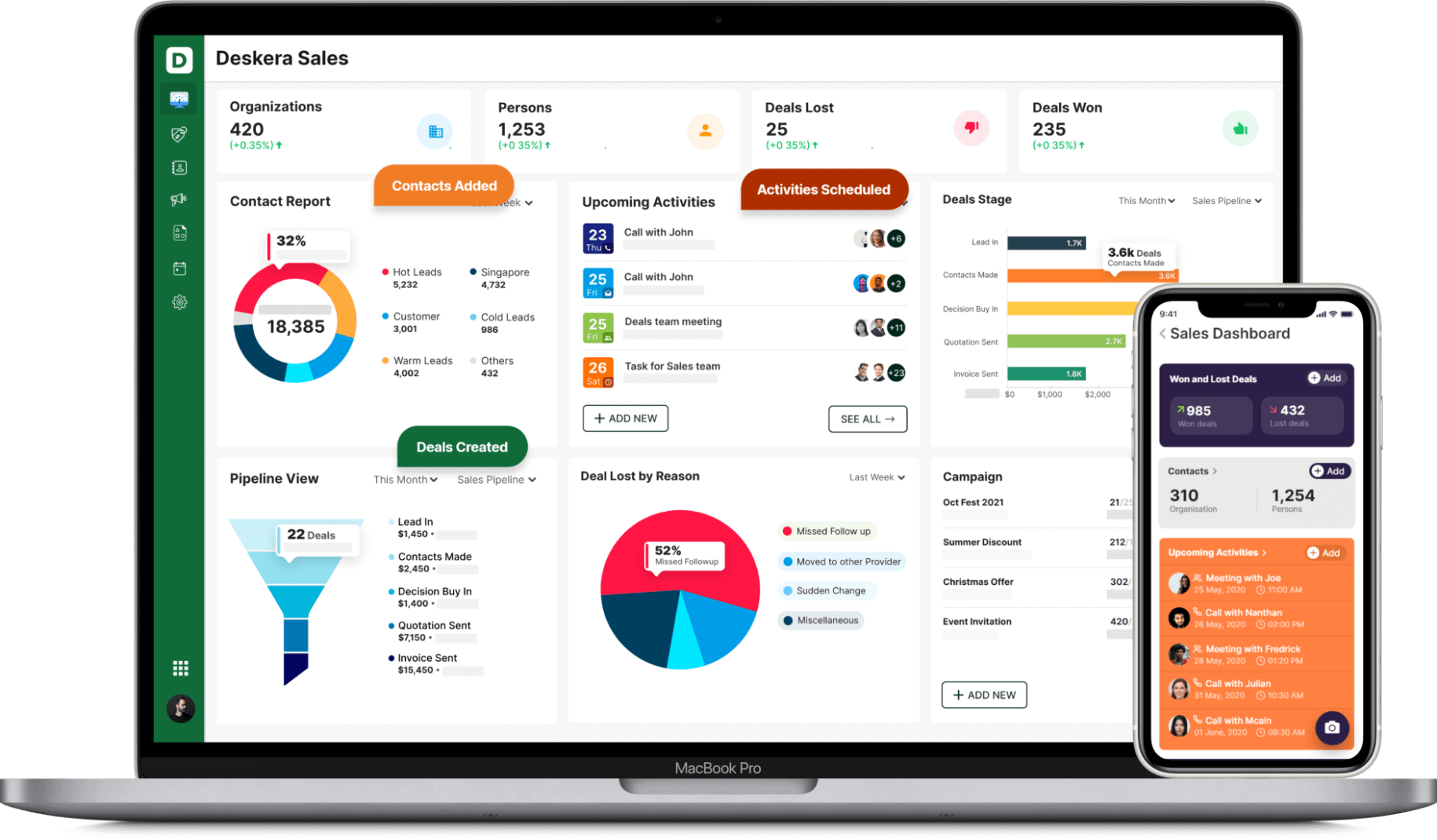
Deskera is one of those unique software that facilitates the designing and management of landing pages through your CRM software. For this, Deskera CRM+ is what you are looking for.
Deskera CRM+ is a software that has a special section dedicated to landing pages. This section is designed such that it will help you throughout the process of designing, launching, tracking and optimizing your landing pages.
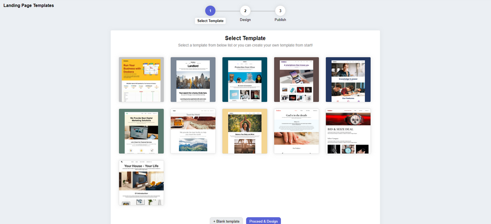
Deskera CRM+ comes with some pre-installed landing page templates that you can use or you can even choose to design your landing page from the start. Both of these options are supported in the Deskera CRM+’s landing page module. This will ensure that you can create beautiful and professional-looking landing pages that generate leads without the help of any designers or IT professionals.

With Deskera CRM, you can enhance your business productivity by facilitating the automation of your email marketing strategies. Deskera is based on a cloud system model that can help to fulfill all your business needs. Be it data integration, or real-time analytics, Deskera can help you in every aspect.
Deskera CRM is the best platform that can help you with contact and deal administration, sales pipeline management, email marketing campaigns, to name a few. Not only this, but you can also generate leads for your business by creating email campaigns and view performance with detailed analytics on open rates and click-through rates (CTR).

Deskera is a cloud-based technology that automates corporate processes and thus makes them easier to manage. It cuts down on administrative time while simultaneously enhancing productivity.
Deskera provides you with solutions such as Deskera CRM Plus that can help your business by providing you with landing page building templates for your business. Deskera CRM helps small businesses get more from each landing page you create. It lets you build and optimize landing pages that prompt you to improve conversions for your business and increase your sales and revenue. You can create good lead magnets to generate better responsive landing pages.
Deskera CRM Plus provides you with the tools and template to build customized landing pages as per your business. It provides you the option to modify images, text, customer sign up form, embed custom html and let's you monitor your website visitors behaviour. Using the website and landing page analytics, you can understand your customer's psychologyand improve your sales.
Having a focused sign-up landing page, your business will be able to increase it's customer database and will help you retarget your existing customers and also manage customer deals and sales funnel better. Managing your customers using a good CRM system, will save your business lot of time and money in the long run.
So, don’t wait anymore, get going with Deskera and ensure the success of your business!
Key Takeaways
Well! Finally, you have sailed to the end part of this detailed guide. Here is the final list of takeaways for your reference. It includes:
- An event landing page is basically an inexpensive web-designed digital advertisement.
- Creative Cruise Event designers located the site menu at the bottom of the page tearing old notions.
- WPEngine Decode event page design includes an attention-grabbing headline that aims to target its visitors.
- B2B Marketing Exchange event landing page provides clear and elegant animation.
- Crimons landing page offers a spectacular template with a classic look.
- Adobe Summit Event landing page has beautifully covered its branding in the form of design and offers a complete professional look.
- Red Hat Summit event landing page has a Hero segment that includes clear images that further connect to the main heading.
- Confab includes a grid that covers speakers from previous to latest events. It provides an overview of featured speakers.
- Affiliate Summit West includes reviews or testimonials available on the landing page to make it more reliable and trustworthy for visitors.
- Collision Conference uses video on the page to make it more engaging and convincing to potential visitors.
- Running Remote event includes multiple CTA buttons throughout the website encouraging people to sign up
Related Links


