Whether you are a newbie or an experienced marketer, you must have heard the term call-to-action several times. But what exactly is call-to-action and why it is important?

Well, call-to-action encourages your audience to take an action such as submitting contact information, signing up for a newsletter, buying a product or service, sharing your content on social media, and a lot more. They are essential for businesses because they help visitors to convert into leads, and further leads into customers.
What is Call-to-Action?
A call-to-action is a statement that tells the target audience what they should be doing once they click on your ad and arrive at the landing page. For example, ‘Buy now’, is the simplest example of call-to-action.
The more information you can provide your potential customers, the better it will be for everyone. This way your audience will get a better idea of what to expect when they click on your ad. You should have a clear idea as to what phrases or messages your customer would respond to.
The call can be in the form of the direct request such as ‘click here’ or ‘contact us now’ and should be placed in the strategic position where the chances of it getting clicked are higher.
According to recent research, it has been found that call-to-action can help to increase monthly revenue by 83%. Now that’s huge!
What is the Purpose of Call-to-Action?
The main purpose of call-to-action is to improve user engagement and conversion rate, to change visitors into leads.
Having a strong CTA will help the audience to delve deeper into your content, and hence into the sales funnel.
With the help of a call-to-action, you get your audience to sign up for newsletters, access gated content, or grab future deals.
When someone follows your CTA, it seems that he/she has an interest in your product or service. These interested people can further ask questions from you regarding your product. Thus, you get the opportunity to connect with them and answer their queries.
You can also explain how your product can benefit them. This will further help you in solving the problems of the prospect customers and improving the sale.
What are the Examples of CTA?
Establishing a CTA is important, but doing it effectively is more important. You need to encourage your audience to take a particular action, for that you need to be blunt.
Some examples of CTA are:
- Subscribe to our blog
- Sign up for new discounts
- Sign up for our newsletter
- Go watch this video
- Call us now
- Click here to save more
- Get this tip
- Go read this blog post
- Watch this video
- Share this
How your word your CTA plays a vital role in making it clickable. Try to use an action verb while creating your CTA.
There are many other tips that can help you to create an effective CTA. Let’s take a look:
Effective Ways to Create a CTA
Simplicity is the Key
Try to keep your CTA as simple as possible. The message that you want to give should be clear to your audience. If your message is not clear, your audience can miss your message, thus being unable to click through. Try to put yourself into the shoes of the target audience, so that you get to know if the message is clear to the ones who are new to your website.
Professional Design is Important
Design is the most important element while creating a CTA. If you are not good at designing, you can consider using pre-created templates. Clarity is the most important factor that you need to consider while designing a CTA. Make sure that your CTA is clearly visible, the colours should stand out against the rest of the content on the page without causing any distraction for the audience.
Changing the colour can be beneficial in getting a greater number of clicks. That is why it should be chosen wisely.
Red
Most people prefer red CTA buttons because the red colour stands out on the page. It also signifies urgency. This can turn out to be advantageous for you because you want people to click on the button immediately.
Green
Green is a colour that indicates all is good i.e., people should go ahead with whatever they are considering. However, in a survey conducted by HubSpot, it has been found that red outperforms green by 21%. But this doesn’t mean green should always be replaced by red. You should choose the colour according to the website you are dealing with.
For example, if you have an agricultural website or a website related to the environment and ecological balance, then green is the best option to choose.
Orange/Yellow
These are bright colours that help CTA to stand out on a page. Every colour is associated with some kind of emotion. For example, orange is a warm colour that helps people to feel good.
These colours can help to improve user engagement. However, there are some colours that should be avoided. Black, brown, and white are some of the colours that should be avoided while creating a CTA. Black and white colour are not bright colours, hence they do not stand out on the page.
Have the Right CTA Placement
The placement of your call-to-action is an important aspect that needs to be considered. It depends upon a plethora of factors.
Ideally, the call-to-action button should be placed ‘above the fold’. This means that the button should be placed in such a manner that it becomes clearly visible without having to scroll down. Placing the CTA above the fold increases the chances of conversion because when people visit a page, they look at the top of the page firstly.
You can even place your CTA on the sidebars. Some people prefer to keep CTA at the bottom of the page. So, it all depends on the layout of the page.
Make Sure your CTA Offers Value
Apart from the design, value is a prominent aspect that cannot be ignored. You should always think that how you are going to add value to your audience once they click on a CTA button. If people are not sure that will get any benefit from clicking the call button, they aren’t going to click it.
Test Multiple CTA Versions
Whether you are a novice or an experienced marketer, you need to have a good idea of what will work for you. However, there is no exact formula to determine what practice can work for you. You need to experiment a lot to get your hands on the perfect CTA.
To get the best results, you should test your CTA against the others. You should try A/B testing whenever possible. With the help of this software, you can make changes to CTAs on your website and check which ones work best to get maximum clicks.
This way you will be able to find the best version of CTA for your website.
Use a Strong Command Verb to Start your CTA
It is very important to be clear and concise while creating a CTA. Remember that you don’t have a ton of space in your ad to get your point across as the character limit is only 35 characters. You need your audience to get straight to the point by telling them what they need to do.
For example, if you run an e-commerce website, you can start your CTA with words like “buy”, “shop”, or “order”. If your aim is to promote your newsletter or white paper, begin with words like “download” or “subscribe”. If you want someone to request information, use words like “fill out a form for” or “find out how”.
Take Advantage of FOMO
Fear of Missing Out, also known as FOMO is one of the best tactics when it comes to a successful CTA. When people think that they might lose out on an opportunity that might not come around again, they are bound to take an action immediately. If you mention a sale or a promotion that won’t last forever, it will be tough for the prospects to ignore such kinds of offers. For example, if you promote messages like “Shop Today, Sale ends on Tuesday”, you will surely get additional clicks because people will have Fear of Missing Out (FOMO) of an opportunity to save their money!
Use Numbers Whenever Possible
Most people respond to numbers such as prices, discounts, promotions, incentives, etc. If you include pricing information in your ad, and the user clicks on the ad, it means that he/she is satisfied with the price. This makes it a valuable click, as the chances of conversion are higher in this case. On the other hand, if you don’t include the price, then the user may click your ad, get impressed by your product, but then at the end turn away due to the price offered. Thus, the chances of conversion reduce to a large extent.
So, you should try to experiment with the price as much as possible if you want to grab more leads.
What are the Types of CTA Buttons You can Have on your Website?
A call-to-action is a text or image that prompts the visitor to take an action. However, there is no one-size-fits-all solution for CTAs. You can’t use the words ‘Click here’ everywhere on your website without understanding the context of your website. Then what is the solution for this? You can use multiple types of CTAs to serve different audiences. Let’s take a look at different types of CTAs you can use:
Lead Generation
The main purpose of CTA is to generate leads from your website. If you want to turn the visitors into leads, then you will have to place the CTA button in such a place where there is a high percentage of new visitors.
To serve this purpose, you can place such types of CTAs on the blog section of the website, located at the end, or in the sidebar. You can even place it on the floating bar in the corner. Make sure the CTAs are eye-catching and captivating. Also, they should clearly state the message you are trying to convey to the audience. Visitors should know exactly what to expect once they land on the landing page. An example for lead generation CTA is ‘Download Quotes’
Form Submission
Once your visitors land on the landing page, they will need to fill out a form and click on a button to submit their information to your contact database. This type of CTA is known as form submission CTA.
Since your visitors are just one step away from turning into leads, you don’t want them to turn off. That is why it is essential to trade out your submit button for something more actionable. For example, you have a form containing fields such as first name, last name, and email. Then instead of writing submit on the CTA button, you can write ‘Download your Guide’.
Read More Button
In your website, if you display a feed of content, your blog, study page, or press newsroom, and if you don’t want to display the entire blog on the home page, you can entice the visitors to click on the individual posts by featuring the first few paragraphs on your content followed by a “read more” CTA.
These read more buttons make the posts more engaging and help in achieving the stats that they deserve. This way, people will have to click through to read any post instead of scrolling down on the homepage, which ensures that the post itself gets credited with its own traffic, not the homepage.
Product or Service Delivery
When a new visitor lands on your website, he /she wants to learn about your products or services. The CTA comes into play when you want to convince visitors to get to know what you have to offer in greater detail. So, you might use a CTA like “View our new product features” or “Click for a full list of our services.”
Social Sharing
One of the simplest types of CTAs, social sharing buttons allows you to share the content with your friends or families. It helps the new visitors engage with your brand.
That is why you should try to include these buttons in the blog posts, landing pages, etc. However, don’t include them in places where people give their personal information.
The best part about these social share CTAs is that they are easy to customize.
Lead Nurturing
What about the people who have become a lead but aren’t ready to pay for your services? Well, there is a solution. You can entice these people with a different type of offer that is more focused on your product offering than just a regular funnel marketing offer.
For example, you can create a CTA to offer product demos, free trials, or free quotes.
Closing the Sale
Once you are done with lead generation and lead nurturing, your aim will be to turn those leads into customers. This type of CTA will be sale-focused as you want your potential customers to buy your product or service right now!
An example of this type of CTA is: “Ready to customize your service plan? Contact our sales team” or “Let us get you set up today. Click now to speak with a sales rep.”
Event Promotion
If you are organizing an event whether online or offline, you would want more and more people to attend it. In such cases, you can use an event promotion CTA to raise awareness of the event and drive more ticket sales.
The main advantage of using such type of CTA is that you can place it in multiple locations, depending on the type of audience you are targeting at.
For customers, you can place this CTA on their login page, dashboard, or even on the page where you offer them a receipt. If you have a lead, you can make this CTA appear in your blog sidebar.
For example, “Register today”, “Confirm your attendance”, or “get your ticket now”!
How can Deskera help you in your business?
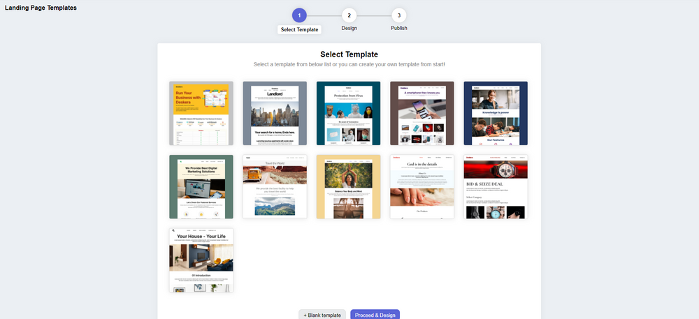
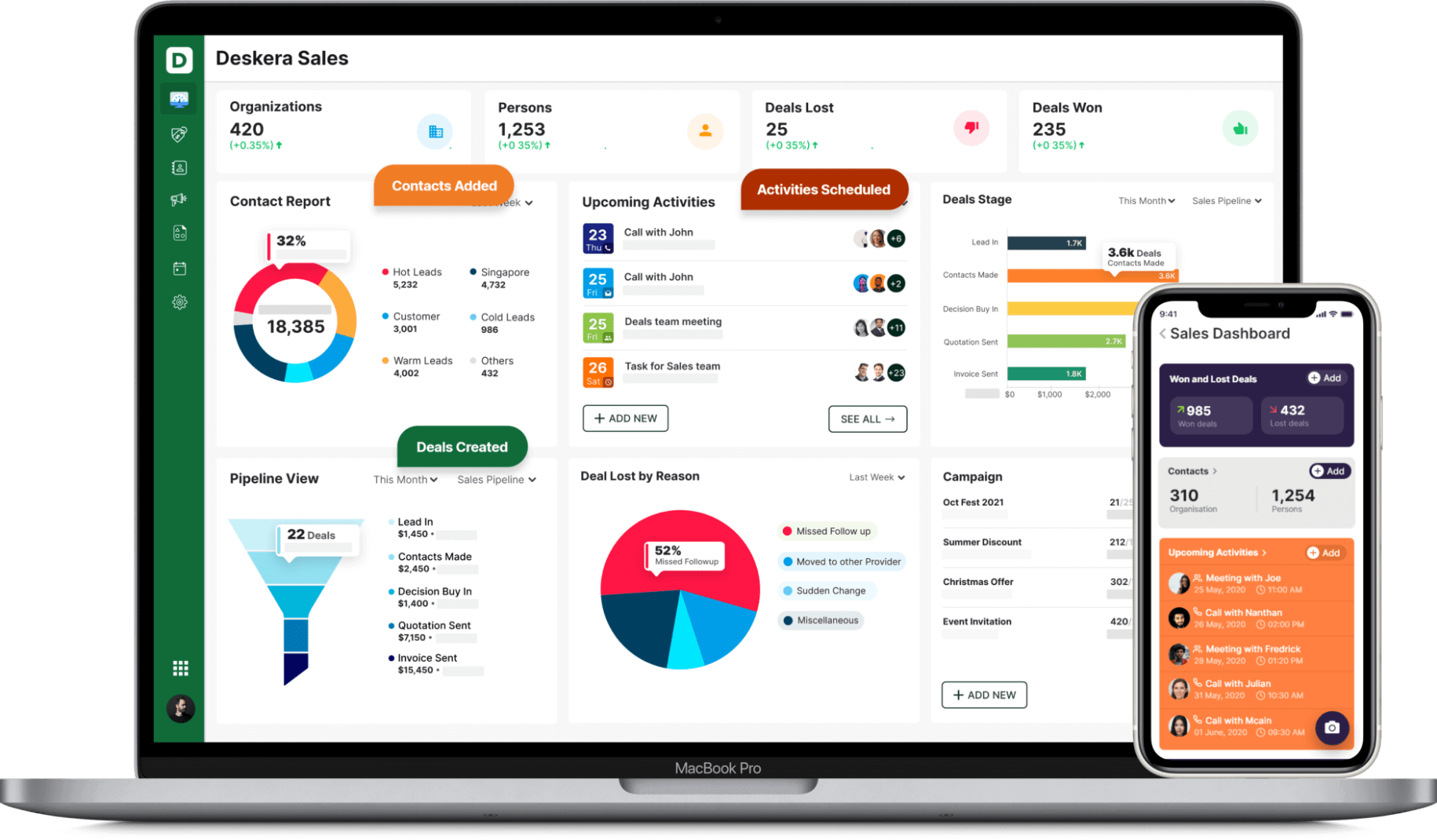
Deskera is one of the best platforms that facilitates the designing and management of landing pages through your CRM software. For this, Deskera CRM+ is the best option.

Deskera CRM+ is a software that has a special section dedicated to landing pages. This section is designed in such a manner that it will help you sail through the process of designing, launching, tracking and optimizing your landing pages.
Deskera CRM+ consists of pre-built landing page templates that you can use for best results. Not only this but you can also design your landing page from the beginning. Both of these options are supported in the Deskera CRM+’s landing page module. In this way, you will be able to create innovative and professional landing pages with top-notch CTA buttons that will help you to generate leads without any external help.
Want to improve your business productivity? Get in touch with Deskera. Deskera CRM helps in facilitating the automation of your email marketing strategies. It is the best platform that can help you with contact and deal administration, sales pipeline management, email marketing campaigns, to name a few. Apart from this, you can also generate leads by creating email campaigns and viewing performance with detailed analytics on open rates and click-through rates (CTR).

Deskera CRM helps small businesses get more from each landing page you create. It lets you build and optimize landing pages that prompt you to improve conversions for your business and increase your sales and revenue. You can create good lead magnets to generate better responsive landing pages.
When you have a focused sign-up landing page, your business will be able to increase its customer database and will help you retarget your existing customers and also manage customer deals and sales funnel better. Managing your customers using a good CRM system, will not only save time but also money in the long run.
With Deskera All-in-One, you can take your business to the next level. It is a platform that offers Invoicing, Accounting, Inventory, CRM, HR & Payroll all under one roof. With Deskera Books, you can know all the significant aspects of business such as billing, payments, warehouse management, Credit &Debit Notes, financial reports, etc.
So, don’t delay anymore, get in touch with Deskera and ensure the success of your business!
Key Takeaways
- A call-to-action is a statement that tells the target audience what they should be doing once they click on your ad and arrive at the landing page.
- The main purpose of call-to-action is to improve user engagement and conversion rate, to change visitors into leads.
- Many examples of CTAs have been discussed in the article.
- There are various effective ways to create a CTA that have been discussed in the article.
- There are eight types of CTAs that have been discussed in the article.
- Deskera can help you in improving the sales of your business by creating landing pages with innovative CTA buttons
Related Links


